TABLE OF CONTENTS
CATEGORIES
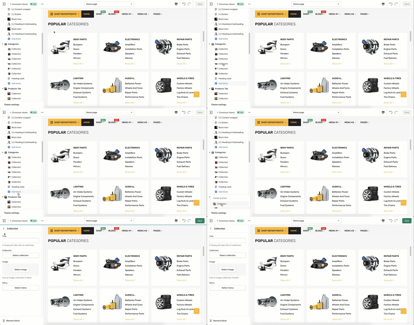
When you need to create a custom section for a specific usage, the Custom Content section will help you with your job. To create a new Categories, click Add Section > find Categories > Click Add button.
I. CONTENT
1. Collection
- Title: Insert a title name for a collection, Eg: Body Parts, Electronics, etc. (If empty, it will take title of collection).
- Collection: Choose a collection to establish, Eg: Main Parts
- Image: Select an image to display (use image collection if blank)
- Menu: Choose a menu to display, Eg: Body Path

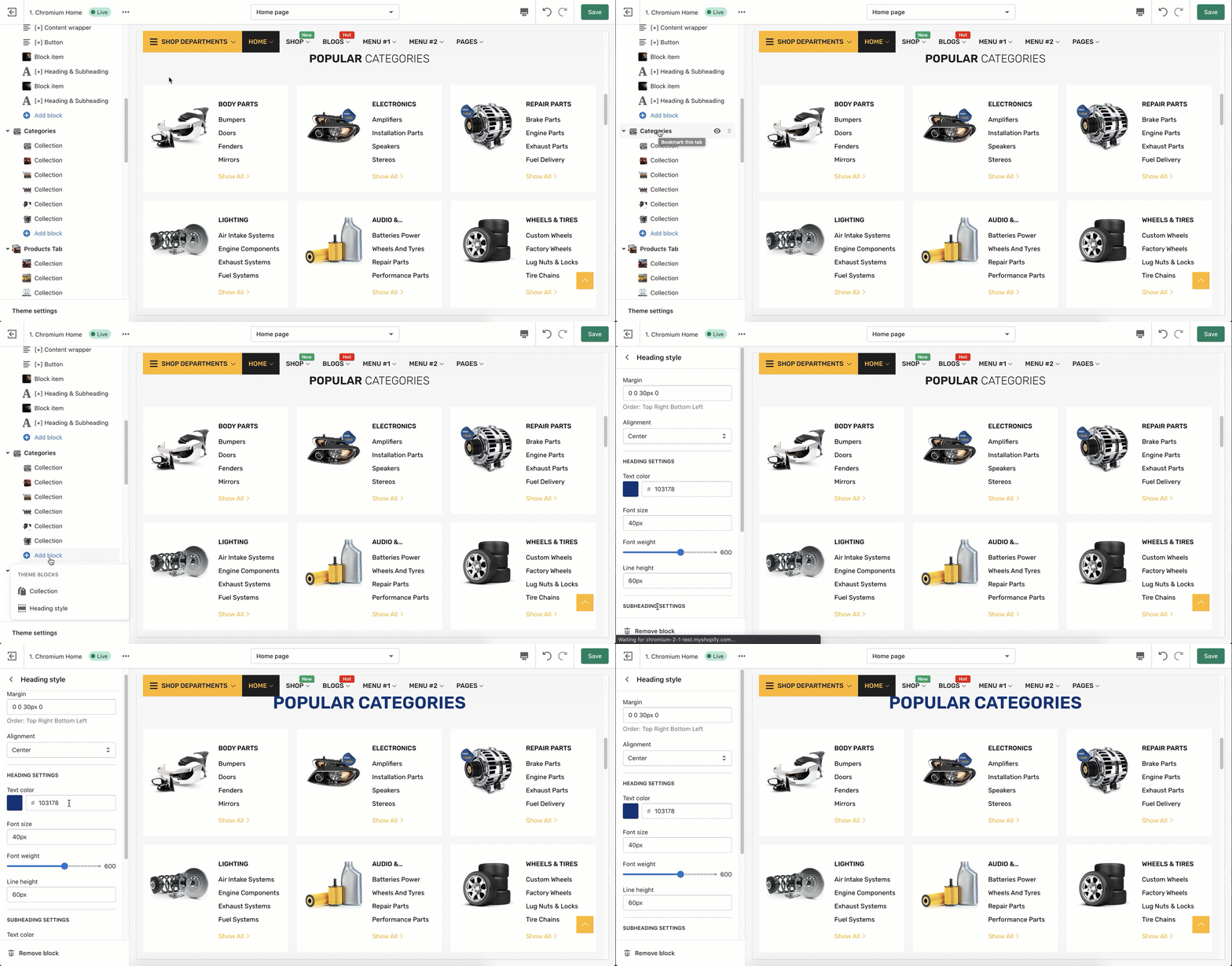
2. Heading style
Margin: Insert the values in order of: Top Right Bottom Left to adjust the margin for the section, Eg: 20px 0px 20px 0px.
Alignment: Left/ Right/ Center
For the Heading & Subheading section, you can modify the items:
- Text color: Choose a color to set for the text
- Font size: Eg: 30px
- Font weight: Drag to adjust the font weight of the text, Eg: 300
- Line height: Input a value to modify the line height, Eg: 20px

II. SETTINGS
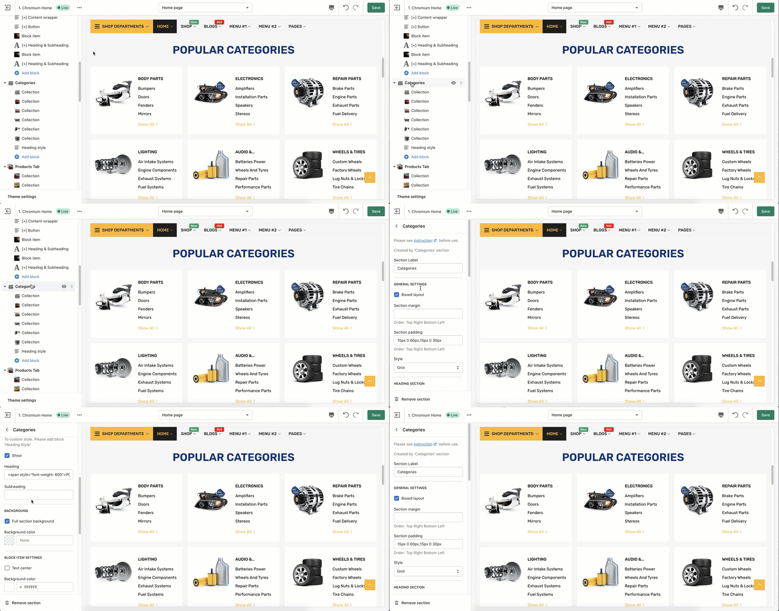
1. General Settings
Tick to enable the Boxed layout: Add a padding around the main wrapper.
Section margin: Insert the values in order of: Top Right Bottom Left to adjust the margin for the section, Eg: 20px 0px 20px 0px.
Section padding: Insert values in order of Top Right Bottom Left to adjust the padding for the section , Eg: 15px 10px 15px 10px

Style: Scroll down to choose a style for the categories: Slider / Grid
2. Heading Section
To custom style. Please add block 'Heading Style'
Tick Show to appear Heading section.
Heading & Subheading: Add a Heading and Subheading for this section or leave it blank. You can add Heading following the sample below:
| <span style="font-weight: 600">POPULAR</span> CATEGORIES |

OR

3. Background
Tick to enable Full section background
For the Background section, you can modify the background color by using the color picker.
4. Block Item Settings
- Check the tick-box to enable Text center feature on each content of items

- Background Color: you can choose any color to display the block item by using the color picker.
- Tick to have Enable Menu to view more content
- Button Label: Name for the button label, Eg: Show all

5. Layout Content
Max number of items per row: The number of items is shown on a row, Eg: 3,1 corresponding with the desktop, mobile. 
Spacing between items: To adjust the space between 2 text boxes, Eg: 30px
6. Slider Settings
Loop: The image slide moves and turns back the first slide.
Controls: Show arrows to move slides easier.
Dots: Show available pages with dots at the section bottom. 
Autoplay: Auto-changed slider
Change slide every(s): the speed move to the next slide (s), Eg: 2s
Note: Please click Save on the Top right of the screen to save the step by step that you just input.
Was this article helpful?
That’s Great!
Thank you for your feedback
Sorry! We couldn't be helpful
Thank you for your feedback
Feedback sent
We appreciate your effort and will try to fix the article


