TABLE OF CONTENTS
- I. GENERAL SETTINGS
- II. BLOCK PRODUCT
- III. BLOCK IMAGE
- IV. BLOCK COUNTDOWN
- V. TEXT BOX
- VI. SLIDER SETTINGS
- VII. HEADING STYLE
I. GENERAL SETTINGS
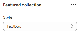
- Style: choose a style to display the featured collection, then scroll down to modify its own settings (Norrmal
Image/ Countdown/ Textbox)
- Layout Mode: Boxed/ Wide
- Background color
- Boder radius: rounds the corners of an element's outer border
- Background image: you can use the image to set background instead of the color
- Section margin: learn how to add values correctly here
- Section padding: following the order - top right bottom left

II. BLOCK PRODUCT
- Heading: enter the text to set heading for this block
- Subtext: you can add a subtext or paste an external link to the box the attach it to subtext
- Collection: select a collection to display its products on the block
- Number items per row: enter the number to set the amount of items showing in a row. Add a comma to set for other devices. Eg: 7,3,2 (Desktop, Tablet, Mobile respectively)
- Spacing between items
- Limit: drag to limit total of the products showing in the section

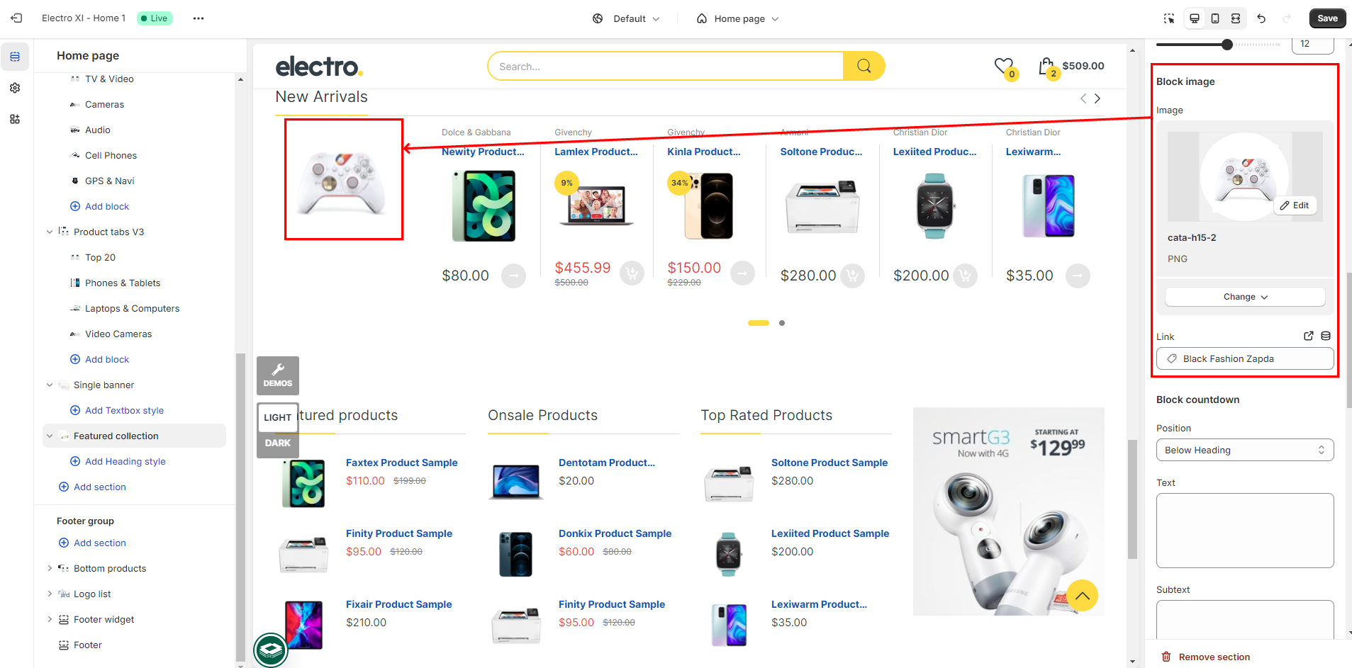
III. BLOCK IMAGE
To dislay a block image on the frontend of your Shopify store, you need to change the Style to Image

- Image: select image to show on the block next to products
- Link: attach link to the image
IV. BLOCK COUNTDOWN
To dislay a block countdown on the frontend of your Shopify store, you need to change the Style to display Featured collection to Countdown

- Position: choose the position to show the countdown
- Same row with Heading
- Below Heading
- Text
- Subtext
- Image
- Expire: you can set freely the expired time in the box (the image is just the demo, default within a day)

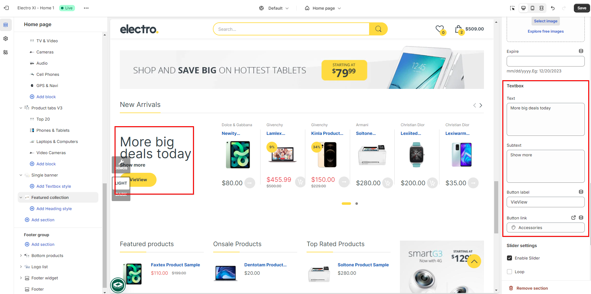
V. TEXT BOX
To dislay a Textbox on the frontend of your Shopify store, you need to change the Style to display Featured collection to Textbox
Insert values into boxes below to display elements:
- Text
- Subtext
- Button label
- Button link
VI. SLIDER SETTINGS
Tick to enable:
- Enable Slider
- Loop: once reaches the end, it repeat from the beginning
- Control: it will appear an arrow to move to the next product.
- Controls position
- Dots: use as indicators to show the number of slides or images within the slideder and to provide user with a visual cue off their current position within the sequence off slides.
- Autoplay
- Control position: Same row with Heading/ Below Heading
- Change slide every (s): drag to auto switch slide in seconds (tick to enable Autoplay)
>>>Demo video Electro XI- Collection Feature [slider settings]
VII. HEADING STYLE
Click on add Heading style block to modify the Heading:
- Alignment: Auto/ Left/ Center/ Right
- Margin: following the order Top Right Bottom Left
- Text color: using color picker to adjust
- Font size: Insert values to modify (in px)
- Font weight: drag to select font weight
- Line height: insert value

Tick to enable:
Was this article helpful?
That’s Great!
Thank you for your feedback
Sorry! We couldn't be helpful
Thank you for your feedback
Feedback sent
We appreciate your effort and will try to fix the article