TABLE OF CONTENTS
I. GENERAL SETTINGS
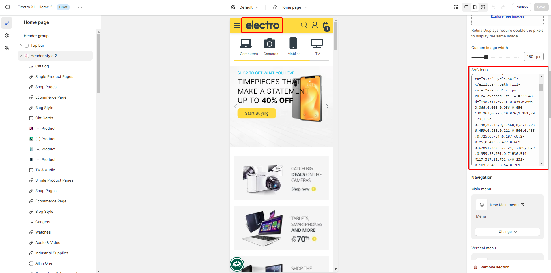
1. Logo -Desktop
Type: choose a type to input the logo (SVG/ Image)
Then select image to show or insert logo code in SVG (based on the type you choose, the system will show the exact logo in that type)
2. Logo -Mobile
The same settings with desktop logo

3. Navigation
Select an menu to show it on:
- Main menu: The main menu is usually displayed as items across the width of the header (Horizontal).
- Vertical menu: The verticle main menu is usually displayed as a list of items in a homepage sidebar (Verticle)
- Mobile menu: This kind of menu is optimized for mobile devices.
Insert the text to the box to show it on the right side of nagvigation

5. Menu Flyout Left
By default, the Flyout menu will be aligned to the right hand edge of the parent item. To align the flyout menu to the right hand edge, you need to enter the menu title, if there are any menu titles, you need to add a separator ; for each. E.g: Home;Catalog
As you can see from the image below, the submenus of “Flyout Left” is aligned to the left hand edge of their parent item.

6. Highlight menu
Enter menu title into the box, add separator if there're many titles
E.g: Home;Catalog

7. Menu label
Enter menu title into the box, add separator if there're many titles
E.g: Home;Catalog
- Text: enter the text to show as label next to the menu title
- Menu title: enter the title you want to attach the label

II. BLOCK SETTINGS
Add blocks to enable the navigation for main menu and vertical menu
When you want to enable the navigation, you must add the block "mega trigger" first and then leave other blocks under it [+menu], [+banner], [+product]...
[+] Mega Trigger:
- Please note that the name of Menu item entered in Mega menu trigger field must match the name of one of the first-level menu items.
- Below are 2 examples for Mega trigger in Main menu and Vertical Menu

 - Background color and Background image: you can use the color picker to adjust the color for the background or you can upload image to also set the background along with the color background

[+] Menu:
- Block label: you can give this menu a name to easily identify it later
- Heading: enter text to show heading on menu item
- Width: adjust the width for this item column
- Menu item: select the menu item to display

[+] Product
- Block label: you can give this menu a name to easily identify it later
- Width: adjust the width for this item column
- Product: select the product to display

[+] Banner
- Block label: you can give this menu a name to easily identify it later
- Width: adjust the width for this item column
- Heading: enter text to show heading on menu item
- Image: select an image to show as banner
- Link: paste a external link or search a destination from the system to attach it to the banner

Was this article helpful?
That’s Great!
Thank you for your feedback
Sorry! We couldn't be helpful
Thank you for your feedback
Feedback sent
We appreciate your effort and will try to fix the article

